
Map based Atlanta zip code study
Introduction
Recently I started this project examining spatial patterns of some demographic and socioeconomic indicators of Atlanta area, in order to have a broad understanding of the market. I chose zip code as study unit because it is the smallest unit that I can find good data of quality. The data I used come from city-data.com, a public website for searching local data. It needs to be pointed out that the data are mostly for the year 2011, but it is not very out of date. To speed up the data acquisition process I wrote a small program to go to pages of all zip codes on my list and download data I need automatically. Also with my Geographical Information System (GIS) background, I think mapping is one of the best ways to present data, so I build results of analysis on a series of categorical maps.
I selected four counties as the whole study area: Dekalb, Cobb, Gwinnett, Fulton, and Clayton – with a total of 110 zip codes. It is a little arbitrary and I may enlarge the study area in the future. I also put primary highways on the map for reference purpose.
In this first tentative exploration, I will present spatial patterns for 9 indicators. Then I will use a group of indicators to perform a group analysis to divide zip codes into 4 categories. Here are the indicators I selected for my first brief study:
- Population density
- Median household income
- Median house/condo
- Median gross rent
- Average household size
- Median age
- Percentage of people with bachelors degree
- Percentage of people who are renters
- Percentage of people who live below official poverty level
So much for introduction, let’s go directly to maps.
1) Population density:
Population density is measured as person per squire mile. As expected, the spatial pattern is a concentric rings form, with downtown Atlanta at the center. The highest density area is surrounded by east and south of I-85, west of I-285, and north of I-20. As it goes further from the center, the density drops gradually. About four or five rings can be identified from the map. The average urban density in the US is about 2400 per square mile. If you are interested, this link shows population density of different census geographic units for the whole country:
http://www.arcgis.com/home/webmap/viewer.html?laye...

2) Median household income:
Median household income is regarded as one of the reliable indicator of economic prosperity. Being median means it shows how does a person in the middle in the population do. If a zip code has a value of $50,000, it means 50% of the households have income above the number, while the other half have less. It is bettern than traditional average income in that a few super rich people do not skewed the number by a lot, which disguised the general situation. For the study area, the map shows a clear north-south divide. It indicates that northern parts of Cobb, Fulton, Dekalb, and Gwinnett counties are the most prosperous areas.

3) Median house/condo value:
Median house/condo value displays a general picture of spatial pattern of real estate values. To some extent it coincides with income distribution, but areas with the highest values are shown in central and north Fulton, and northwest corner of DeKalb County.

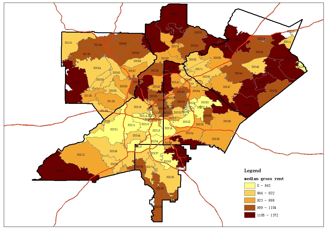
4) Median gross rent:
The median rent map shows higher rent areas are generally far away from center, which may be explained by larger properties in the suburbs. There are a few high rent zip codes near the center too, such as 30338, 30319, and 30327.
5) Average household size:
Average household size shows the general size of the households within a zip code. Household size is usually closely tied to average number of rooms of properties. For example, usually you don’t want to own a two-bedroom condo in a very large household size area. And in such area a four-bedroom house may sell much better than a three-bedroom one. From the map, Gwinnett and Clayton County have the highest household sizes, while small household size zip codes are generally located near central city.

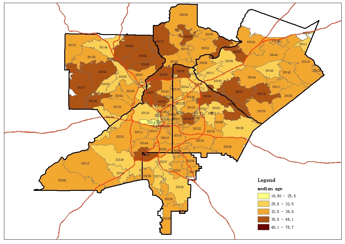
6) Median age:
Median age shows how old or young a zip code is. People in different age groups usually have different preferences for housing. It looks like age is closely related to income. Usually young areas are poor and old areas are rich.
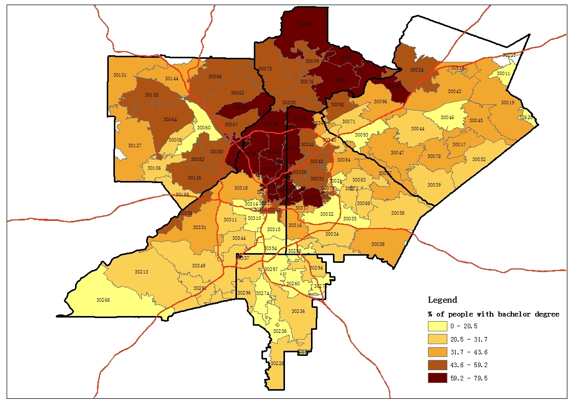
7) Percentage of people with bachelors degree:
Percentage of people with bachelor’s degree is a measure of general educational level. Again it coincides with income distribution with some small variations. There are clearly two major clusters of people of higher education – one in the center and just north of the city, and the other in the further north suburbs.
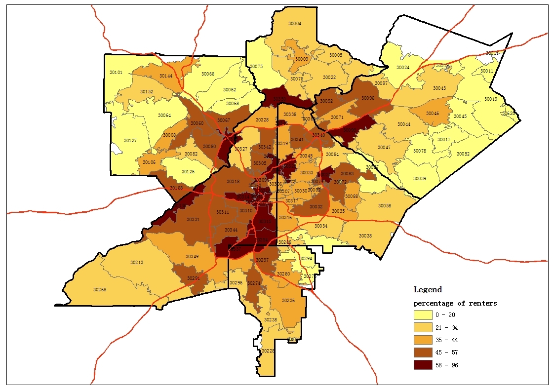
8) Percentage of people who are renters:
This map shows what percentage of people who are renters for each zip code. The map shows that renters are generally located within perimeter, especially the western part. Another pattern that can be identified is high percentage areas are close to major highways, suggesting the importance of accessibility.
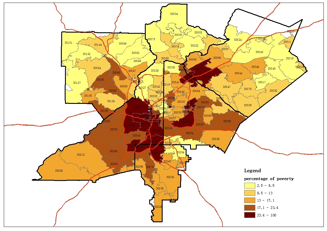
9) Percentage of people below poverty level:
The last indicator is percentage of people living below poverty level, another measurement of economic wellbeing. It shows a similar north-south divide – a relatively reverse picture compared to household income.
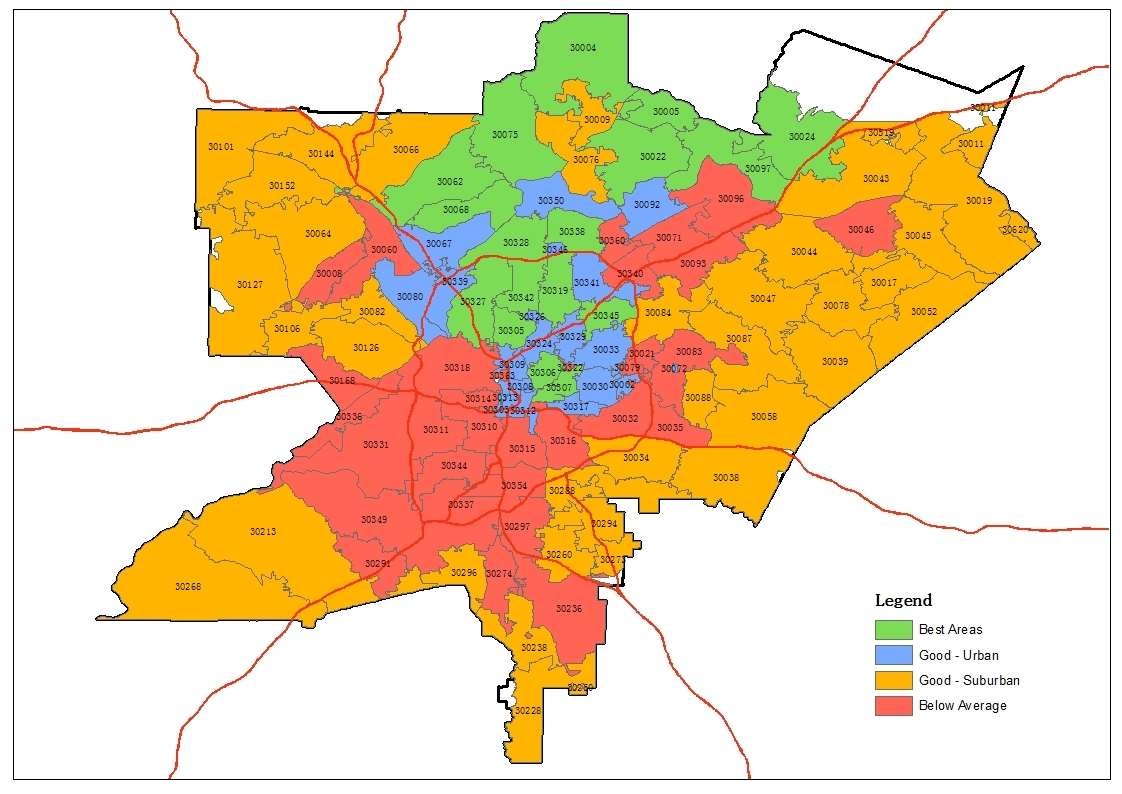
Grouping Analysis:
Besides simple mapping, I also did a grouping analysis using ArcGIS Desktop software. The analysis groups all zip codes into categories based on multiple indicators altogether. I selected 4 as number of categories and here is the result.
- 1.The green areas have the highest income, property value and highest educational level, and obviously the lowest poverty. The density is average meaning there are prosperous zip codes in both urban and suburban areas. Percentage of renters and household sizes are below average, but not by much.
- 2.The red areas, on the other hand, are categorized as low income, low property value and low educational level. The poverty level and renter percentage are high too.
- 3.The blue areas can be described as renting professional working class areas. The median income is average and above average, but not as high as green areas. The educational level is high while the average household sizes are low, indicating many are young single professionals. The population density and percentage of renters are both very high, which shows these are relatively hot rental markets in the city.
- 4.At last, yellow areas are more like mature middle class suburbs. Most of the indicators are average and just above average. The population density is low while the household size and median age are high.
Comments (11)
Hi @Zach Liu,
I'm a geospatial data analyst too. Having just joined BP, I haven't even filled out an intro post yet. Instead I searched "maps" and your Atlanta research came up as #2 in the Blogs section of my search results. I'd love to connect and learn from you and, possibly, help you out.
For instance, the US Census has much more up-to-date data - 2016 TIGER Line. A Google search will allow you to download US Census shapefile by County (although Atlanta is so big maybe it covers multiple Counties). Use the keywords: 'Atlanta', 'TIGER', 'Line' if you want to check this out :)
Ben Fraser
Ben Fraser, about 9 years ago
This is excellent info ... would love to see it drilled down even further like Rick B. suggested. Thanks for posting!
Aaron Lee, over 10 years ago
I'm thinking of investing in Atlanta and since I live in San Diego I find this very helpful! Thank you so much:-)
Jen Hoang, over 10 years ago
@Zach Liu
This is amazing! Have you created an analysis that is more recent? A lot can change in 2 months. I am located in Henry county and would love to see data from there!
Cara Davis, over 10 years ago
@Zach Liu
This is great stuff...where did you get the data and is it possible to create a pipe from those sources so you can dynamically work through the results as you and Rick have been discussing?
Sreenath Vemulapalli, almost 11 years ago
@Sreenath Vemulapalli
Thanks for the comments, most of the data is from city-data.com, and I just wrote a small program to get those data automatically. Further suggestions are welcome:)
Zach Liu, almost 11 years ago
@Zach Liu I love data visualization, and this is a great view. However, it would be worth a lot more if it were zip+4 level and you could show a video of the changes over quarters or years. At this level an investor would skip right over Grant Park and Reynoldstown. School data would also be a great addition.
Great job!
Rick Baggenstoss, almost 11 years ago
Hi Rick.
I agree that using zip code as unit of study only give ballpark results. Given that real estate investment is very local, zip code will hide many local variations.
In the future I will look for finer units for sure, and also trying to find time series data so I can explore the trends.
I may also drive around areas and talk to other investors to verify what I found on paper.
Thanks for the comments.
Zach Liu, almost 11 years ago
@Zach Liu this is fantastic stuff man! thanks for sharing. Tagging a few Atlanta people @James Park @Kiran K @Matt Wood @Mike O'Connor @Fitzgerald Hall
Azeez K., almost 11 years ago
Great post @Zach Liu
Maxwell Hunter, almost 11 years ago
Wow! @Zach Liu This is impressive. Thanks so much for taking the time to pull all of this info. This is so helpful.
Thank YOU!
Anna Ryder, almost 11 years ago