Skip to content
×
Pro Members Get
Full Access!
Get off the sidelines and take action in real estate investing with BiggerPockets Pro. Our comprehensive suite of tools and resources minimize mistakes, support informed decisions, and propel you to success.
Advanced networking features
Market and Deal Finder tools
Property analysis calculators
Landlord Command Center
ANNUAL Save 16%
$32.50 /mo
$390 billed annualy
MONTHLY
$39 /mo
billed monthly
7 day free trial. Cancel anytime

Let's keep in touch

Subscribe to our newsletter for timely insights and actionable tips on your real estate journey.

By signing up, you indicate that you agree to the BiggerPockets Terms & Conditions
×
Try Pro Features for Free
Start your 7 day free trial. Pick markets, find deals, analyze and manage properties.

Posted over 13 years ago

One Chart Says It All

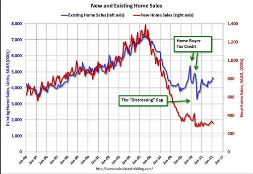
One chart sums up the Housing Market. Not pretty but, what we have to live with. Chart courtesy; calculatedrisk.com.

Photo

Left axis= existing home sales Right axis= new home sales


Comments (2)

  1. Jon, I'm glad to see you optimistic. I was pointing out the large gap between existing home resales and new home sales. New home sales are sucking wind.


  2. It's been quite a decade. The good news is that the chart shows stability starting in 2010-2011.