

One Chart Says It All
One chart sums up the Housing Market. Not pretty but, what we have to live with. Chart courtesy; calculatedrisk.com.
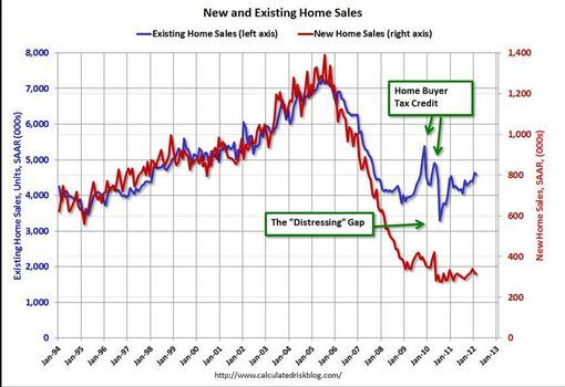
One chart sums up the Housing Market. Not pretty but, what we have to live with. Chart courtesy; calculatedrisk.com.
Comments (2)
Jon, I'm glad to see you optimistic. I was pointing out the large gap between existing home resales and new home sales. New home sales are sucking wind.
Mike Morrison, over 14 years ago
It's been quite a decade. The good news is that the chart shows stability starting in 2010-2011.
Jon Klaus, over 14 years ago