Good news! There are some awesome improvements to the forums that allow for an easier user experience. Keep reading for the highlights.
Easily follow discussions with a simpler design. Plus, users stats are more predominantly displayed so you can quickly identify experts.
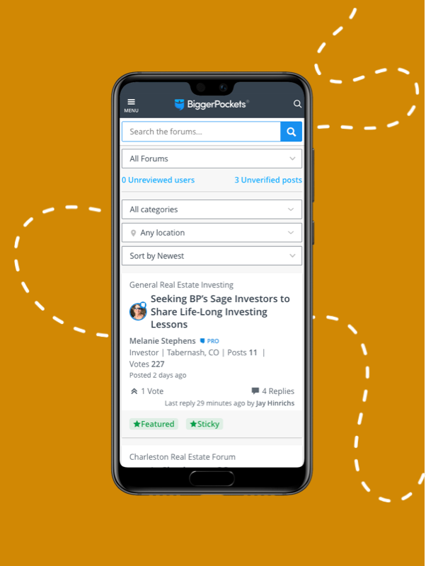
We finally optimized for mobile usability! This way you can stay involved on the go.
Note: the iPhone and Android apps have not been updated, you must visit biggerpockets.com/forums to see the improved mobile experience
Now tag your topic posts with locations that can be easily found via the location filter at the top of your forums experience. Find what you’re looking for faster.
A clean new design with all the most relevant information prominently displayed. This makes the conversation amongst BiggerPockets members that much easier to read!

Oh no! You guys took out the ability to sort by 'most recent' vs 'most relevant' during when searching in the forums?! This is a big loss -- I don't want to see things things from 8 years ago when I'm look for recent info on markets or whatever. For me this renders the search function almost unusable :( Please bring it back!
And small thing, but it's a bit hard to see the date if you do need to scan them after searching, maybe keep it in black since it's already smaller anyhow?
our
@Elizabeth Goff we have taken note of this, thanks for the feedback.
Admins - Note that the only people who like the new forum look are people with very few posts. They've never really used/seen the old forums. Just sayin'.....
I will take a few daggers for saying this, but I like the new forum look and I have more than a few posts;)
To be fair, I have used the new forums for three months now. I was on the beta testing team. It took me some time to get used to it, so I encourage you to hang in there. Nobody wants to lose you or any other top contributors. You will get used to it and forget what the old forums even looked like. The BP team is very open to making tweaks and addressing concerns, so your feedback is being heard. That is why this thread is open for comments.

This comes down to how people use the forums and how they interpret information. Of course we are all different. The grey box behind the text visually tells me what people are responding to. My eyes move to the response immediately and I just scroll past the grey box, unless I need to read it for context. In that way I find the grey box very helpful compared to before.
The text you boxed in green is basically a header bar separating posts. I think it helps to break up responses and it keeps the side bar from being too wide. If you put too much text in the side bar, it makes the center text more narrow, meaning more scrolling to read. It also creates a problem for the mobile web version, because a phone is not wide enough to have that much text on the side. You could have two different formatting methods for phone and desktop, but maybe that is harder to manage. I wouldn't be opposed to any of the changes you proposed, but I don't find either option mentally taxing.
I agree with the others, I preferred the old style by a lot. Everything just seems too "busy" now. Like every page is a giant wall of text and there's no separation.
I do understand having to make the change because the old forum or theme was no longer supported. That is a bummer. This has been a pain point in every forum I've ever run or been a part of. We all miss the old look, but eventually get used to the new one.
Personally though my biggest gripe is the move to kind of make the whole forum like one giant facebook feed, rather than an actual forum separated by sub-categories. I've noticed the last few days an overwhelming number of people in sub-categories giving answers not relevant to that sub-category, because they came to the thread via some giant jumbled feed and don't realize they're in that sub-category.
For instance I spend most of my time in the STR forum. Typically most people posting there were specifically in the STR forum, answering threads specific to STRs. IE if someone asked about property managers or markets everyone knew they were asking about STR property managers or STR markets.
That is no longer the case. Now if someone posts in the STR forums about property managers or markets 90% of the responses are people that have no knowledge of STRs giving info on buy and hold PMs or the best market for flipping homes. They don't realize they're in the STR forum, so they're giving info not relevant to STRs.
I didn't realize why it was happening until I saw this thread and someone mentioned the dropdown. Hovering over "forums" no longer brings down the subforums. Even clicking on "forums" just brings up a feed of recent posts rather than a list of forum categories, which is different than any other forum site. If I didn't already have the STR forum bookmarked I wouldn't even know how to get there.
It has made the experience significantly worse, to be honest. It defeats the entire purpose of a forum IMO. The baseline of a forum is to drill-down by sub-category into a specific subforum, and browse there. Viewing a feed of new threads or popular threads should be a separate, intentional button click. Not the baseline.
@Ryan Moyer thanks for the valuable feedback and insight. we are working towards continuous updates to deliver a great user experience and appreciate users like yourself who take the time to provide more detailed feedback. we have taken note of a number of things brought up in feedback and will be assessing updates moving forward.
Admins - Note that the only people who like the new forum look are people with very few posts. They've never really used/seen the old forums. Just sayin'.....
I will take a few daggers for saying this, but I like the new forum look and I have more than a few posts;)
To be fair, I have used the new forums for three months now. I was on the beta testing team. It took me some time to get used to it, so I encourage you to hang in there. Nobody wants to lose you or any other top contributors. You will get used to it and forget what the old forums even looked like. The BP team is very open to making tweaks and addressing concerns, so your feedback is being heard. That is why this thread is open for comments.

This comes down to how people use the forums and how they interpret information. Of course we are all different. The grey box behind the text visually tells me what people are responding to. My eyes move to the response immediately and I just scroll past the grey box, unless I need to read it for context. In that way I find the grey box very helpful compared to before.
The text you boxed in green is basically a header bar separating posts. I think it helps to break up responses and it keeps the side bar from being too wide. If you put too much text in the side bar, it makes the center text more narrow, meaning more scrolling to read. It also creates a problem for the mobile web version, because a phone is not wide enough to have that much text on the side. You could have two different formatting methods for phone and desktop, but maybe that is harder to manage. I wouldn't be opposed to any of the changes you proposed, but I don't find either option mentally taxing.
Your logic counters itself in this response. At first, scroll length doesn't matter, you'll just keep scrolling. Then later on it does (examples bolded and underlined above). I am certain that this particular post I'm about to make will be enormously long, and the forum software fails to compensate for that.
If you are trying to say its stupid that I have to scroll through multiple of screens lengths worth just to read your 3-4 sentences, then I agree. This is really stupid, and wasteful.
Admins - Note that the only people who like the new forum look are people with very few posts. They've never really used/seen the old forums. Just sayin'.....
I will take a few daggers for saying this, but I like the new forum look and I have more than a few posts;)
To be fair, I have used the new forums for three months now. I was on the beta testing team. It took me some time to get used to it, so I encourage you to hang in there. Nobody wants to lose you or any other top contributors. You will get used to it and forget what the old forums even looked like. The BP team is very open to making tweaks and addressing concerns, so your feedback is being heard. That is why this thread is open for comments.

This comes down to how people use the forums and how they interpret information. Of course we are all different. The grey box behind the text visually tells me what people are responding to. My eyes move to the response immediately and I just scroll past the grey box, unless I need to read it for context. In that way I find the grey box very helpful compared to before.
The text you boxed in green is basically a header bar separating posts. I think it helps to break up responses and it keeps the side bar from being too wide. If you put too much text in the side bar, it makes the center text more narrow, meaning more scrolling to read. It also creates a problem for the mobile web version, because a phone is not wide enough to have that much text on the side. You could have two different formatting methods for phone and desktop, but maybe that is harder to manage. I wouldn't be opposed to any of the changes you proposed, but I don't find either option mentally taxing.
Your logic counters itself in this response. At first, scroll length doesn't matter, you'll just keep scrolling. Then later on it does (examples bolded and underlined above). I am certain that this particular post I'm about to make will be enormously long, and the forum software fails to compensate for that.
It is two different types of scrolling. One is jumping between responses. You scroll past the grey and stop. The other is scrolling as you read. Think of it like skipping commercials. If you had to fast forward through 5 minutes of commercials every 30 minutes, it is easier than skipping 10 seconds of commercials every minute.
The grey boxes are normally pretty small, but in cases where people have long responses, they do get big. I agree in that case, having it collapse would be useful.
I would say collapsing the grey box makes more sense than moving the two line text "green" header. Just my opinion. Maybe on your screen size/resolution it is worse than on mine. I also have the benefit of using the new interface for several months, so I am adjusted to it.
It is good feedback you provided. I am not a decision maker in any of this;) Let the BP overlords discuss and do as they wish.
This is great! Suggestion for future improvements - Can BP add a sort by newest to oldest? Because when I search I see 7 yrs, 3 yrs, 1 month ago, 9 yrs, etc. Its very frustrating because then I feel as though I'm getting out dated information. Especially since things are so different since covid. Thank you in advance if y'all could fix this.
FYI, if you have to educate your users about the forums, you've already failed. The most successful forums are the ones an idiot could use.
I know many of these have been mentioned before, but I'll mention them again:
Admins - Note that the only people who like the new forum look are people with very few posts. They've never really used/seen the old forums. Just sayin'.....
I will take a few daggers for saying this, but I like the new forum look and I have more than a few posts;)
To be fair, I have used the new forums for three months now. I was on the beta testing team. It took me some time to get used to it, so I encourage you to hang in there. Nobody wants to lose you or any other top contributors. You will get used to it and forget what the old forums even looked like. The BP team is very open to making tweaks and addressing concerns, so your feedback is being heard. That is why this thread is open for comments.
I'm confused. There's no longer a Bigger Pockets app in the Apple App Store. Do you mean when we use the site in our phone's web browser, @Alicia Marks?
Hasn't been a BP app available for a long time. Just those that downloaded it a long time ago... They are pretty much referring to some sort of mobile browser effect. But, its still horrible to me. I can't use the boards on a mobile browser.
Doesn't seem like a lot of thought was put into layout or functionality. I only use desktop so can't comment on any mobile optimizations.
You can only see 2-3 different discussions at a time on the screen even with a large monitor. This causes you to need to do an awful lot of scrolling to find a post that interests you. I would recommend significantly scaling back on how much of a post you can preview without clicking on it so that you can see more posts on the screen at once to more readily identify posts that you actually want to click on and read.
The fact that you can only see 2-3 different posts at a time is compounded by the fact that advertisements are included in the same general space. Ads could easily be moved to a sidebar area where they could remain static and always visible while you scrolled posts in the main section.
Hovering over the forums tab at the top doesn't provide any sort of breakdown of sub categories like the education and network tabs do.
Clicking on the actual forum categories button pulls up a list of categories that involves significant scrolling to see what options you have available. Real estate isn't rocket science, I should be able to see all of the forum categories on one screen without needing multiple full scrolls of the mouse wheel to scroll through all of the different categories....
Which leads to my next point, there are WAY too many forum categories, many of which are HIGHLY redundant.
You have a "general real estate investing" which is separate from your "general info" subcategory.
There is an "investor deal diaries", as well as a "completed deal diaries", and a "rehab diaries", and a "success stories" and a "not so success stories"
"Rookie investing" as well as a "first time home buyer", and a "starting out".
"Real estate events and happenings", and a "BPCon attendees", and a "BP real estate investing summit"
"Housing news and real estate market discussions", and a "real estate news and current events"
I could probably find other many examples of redundant categories, but you get the point, many of these categories are redundant and would be better off merging them together to create a more unified experience. Additionally having links to the various podcasts inside of the forum categories further clogs up the searching since forums and podcasts are two completely separate products.
Some categories like BP con 21 are completely irrelevant since the entire event is over, other categories like the investing summit category only have 4 total posts. Other categories like Real Estate Quizes sounds like it should be something in the education tab and not in the forum tab, not that it really matters since there isn't even a single post inside the real estate quizes category.
Podcasts are a big enough part of what this site offers that it deserve its own tab at the top just like forums, education, and network have instead of burying it in the education tab.
I could probably go on with other things I dislike, but in general someone needs to put some serious thought and effort into the layout and functionality of the desktop version of this site. As it stands it looks like a product that was created by paying some guy on Fiverr $20 bucks and he used a generic wordpress template.
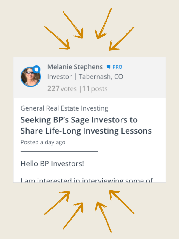
Do we have any way to get the forum view back to the previous look? This new forum layout is just far to much to look at and get use to compared to the previous view. I referred some one this website today and they said they were lost trying to post a reply. Can we please have a "Old View" option?
@Alicia Marks why not update the mobile app? I and 100k other users have an Android app. I assume there are an equal or greater number who have the iPhone app. Doesn't make sense to go to the mobile browser.
FYI, if you have to educate your users about the forums, you've already failed. The most successful forums are the ones an idiot could use.
I know many of these have been mentioned before, but I'll mention them again:
@Greg M. ive read through and made note of all your feedback, really appreciate the insight and will be continuing to prioritize the ways to elevate our forums user experience.
Doesn't seem like a lot of thought was put into layout or functionality. I only use desktop so can't comment on any mobile optimizations.
You can only see 2-3 different discussions at a time on the screen even with a large monitor. This causes you to need to do an awful lot of scrolling to find a post that interests you. I would recommend significantly scaling back on how much of a post you can preview without clicking on it so that you can see more posts on the screen at once to more readily identify posts that you actually want to click on and read.
The fact that you can only see 2-3 different posts at a time is compounded by the fact that advertisements are included in the same general space. Ads could easily be moved to a sidebar area where they could remain static and always visible while you scrolled posts in the main section.
Hovering over the forums tab at the top doesn't provide any sort of breakdown of sub categories like the education and network tabs do.
Clicking on the actual forum categories button pulls up a list of categories that involves significant scrolling to see what options you have available. Real estate isn't rocket science, I should be able to see all of the forum categories on one screen without needing multiple full scrolls of the mouse wheel to scroll through all of the different categories....
Which leads to my next point, there are WAY too many forum categories, many of which are HIGHLY redundant.
You have a "general real estate investing" which is separate from your "general info" subcategory.
There is an "investor deal diaries", as well as a "completed deal diaries", and a "rehab diaries", and a "success stories" and a "not so success stories"
"Rookie investing" as well as a "first time home buyer", and a "starting out".
"Real estate events and happenings", and a "BPCon attendees", and a "BP real estate investing summit"
"Housing news and real estate market discussions", and a "real estate news and current events"
I could probably find other many examples of redundant categories, but you get the point, many of these categories are redundant and would be better off merging them together to create a more unified experience. Additionally having links to the various podcasts inside of the forum categories further clogs up the searching since forums and podcasts are two completely separate products.
Some categories like BP con 21 are completely irrelevant since the entire event is over, other categories like the investing summit category only have 4 total posts. Other categories like Real Estate Quizes sounds like it should be something in the education tab and not in the forum tab, not that it really matters since there isn't even a single post inside the real estate quizes category.
Podcasts are a big enough part of what this site offers that it deserve its own tab at the top just like forums, education, and network have instead of burying it in the education tab.
I could probably go on with other things I dislike, but in general someone needs to put some serious thought and effort into the layout and functionality of the desktop version of this site. As it stands it looks like a product that was created by paying some guy on Fiverr $20 bucks and he used a generic wordpress template.
@Ben Zimmerman thanks for the feedback, a lot of what you've made mention of we have on our hit list and what we didnt we've taken note of.
Thank you
I'm confused. There's no longer a Bigger Pockets app in the Apple App Store. Do you mean when we use the site in our phone's web browser, @Alicia Marks?
Hi Scott,
Great question! Yes, we recommend you use the website for now on mobile, instead of the app. There are no immediate plans to bring the app back, but we are constantly evaluating the best way to deliver a great mobile experience.
Thanks,
Did you guys not get the memo?
Don't fix if it ain't broken..
Who thought this was a good idea? What garbage UI.
Here is a mockup I did for discussion.
The View More link should go to the last post.
The pic should feature the last poster vs the OP.
The blurb from the post should come from the OP's first X amount of words.
The mockup:
Eliminates the white space between the posts.
Uses a smaller font with only 2 variants in size.
Uses grey lines to delineate the posts.
Features a Reconfigured layout.

hmmm it loaded large enough to read, but isn't expanding on click--possible bug...(???)
I'm confused. There's no longer a Bigger Pockets app in the Apple App Store. Do you mean when we use the site in our phone's web browser, @Alicia Marks?
That is correct. We are not offering the BiggerPockets app anywhere until our coding is improved so that we can include the needed features to make the app worthwhile.
Here is a mockup I did for discussion.
The View More link should go to the last post.
The pic should feature the last poster vs the OP.
The blurb from the post should come from the OP's first X amount of words.
The mockup:
Eliminates the white space between the posts.
Uses a smaller font with only 2 variants in size.
Uses grey lines to delineate the posts.
Features a Reconfigured layout.

hmmm it loaded large enough to read, but isn't expanding on click--possible bug...(???)
Workaround to see full size image:
To open the image (bigger) you have to right click--open in a new tab--then resize it in the browser if you want.
Whenever I do a search in the forum, searching for a specific topic, it seems the responses always seem to be very outdated, from years ago. Is there a way to pull up relevant posts that are listed as most current? Am I missing something when searching?
I've used BP for one year. Found the forums to be very helpful. Now that this site has been upgraded it's much harder to navigate and I am very displeased. Strongly considering no longer using this site and closing my account. Please revert back to the previous version or repair this one. It really sucks!
I don't go to Bigger pockets forums very often for the following reason. 1) it'd difficult to know how to find what I want to find. I know the info's out there this is the smarted group of people in the investing world. 2) If I have to post a question I don't know how. 3) OMG friging Tag,#, blah, blah blah I'm an old fart. I still call and talk to people I love to shake hands and have a drink at a bar with a like wise investor. K.I.S.S.
I love to read some of the forums and of all the social media I've used this is with out a doubt the greatest.
I don't know how to create a search engine, program, function or thing a ma jig but I do know it needs to be simple for first time users (you get new members daily) an constant we come and go to BiggerPockets and don't want to spend an hour to just relearn something to get an answer which is why we come hear, to learn, to share, to assist those who need assistance. Sorry for my rant.
The search function before was not great at filtering and often your selections 'reset' every time. Now it is basically unusable.
I often have to go to google and search specifying "site:https://www.biggerpockets.com/forums" along with the terms and date range to make things work. It really should not be this hard to search a function and unfortunately it is getting worse. Please work with users on actual usability.