The Forums have a new look coming Monday, February 7th!

The Forums have a new look coming Monday, February 7th!

Alicia MarksPro Member
Fort Worth, TX · Member since 2020 · 1k+ posts · 2k+ votes

Good news! There are some awesome improvements to the forums that allow for an easier user experience. Keep reading for the highlights.
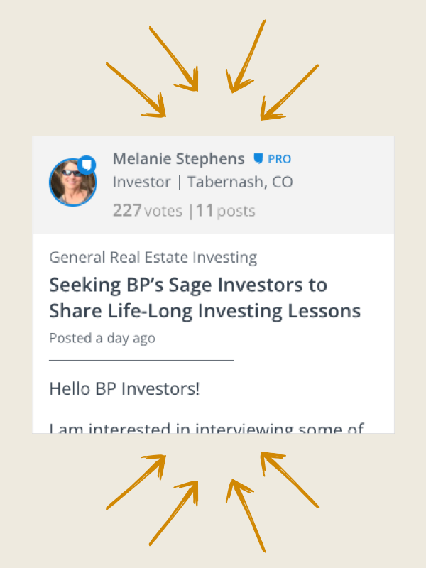
Easily follow discussions with a simpler design. Plus, users stats are more predominantly displayed so you can quickly identify experts.

We finally optimized for mobile usability! This way you can stay involved on the go.

Note: the iPhone and Android apps have not been updated, you must visit biggerpockets.com/forums to see the improved mobile experience
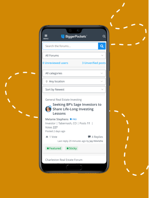
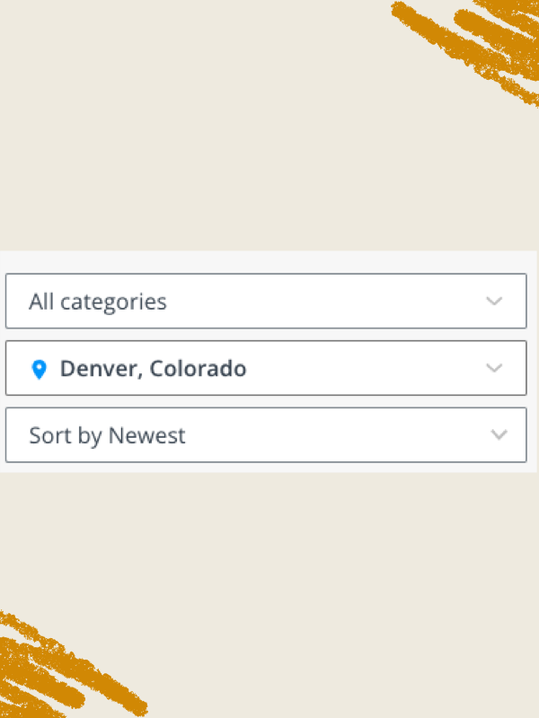
Now tag your topic posts with locations that can be easily found via the location filter at the top of your forums experience. Find what you’re looking for faster.

A clean new design with all the most relevant information prominently displayed. This makes the conversation amongst BiggerPockets members that much easier to read!

63Reply
556 views

Most Popular Reply

Investor · MI · Member since 2015 · 227 posts · 478 votes
4y
Every time the forums get "easier to use" I have a harder time using them....
See this reply in the discussion

214 Replies

Jump to latestLatest
  • Realtor | Product Manager at BiggerPockets · Metro Detroit, MI · Member since 2022 · 119 posts · 127 votes
    4y

    @Bruce Woodruff we are going to iterate off of this new version which gives us a better ability to make efficient and effective improvements. In order for those improvements to be effective though, we do look for and value you guys' feedback so we appreciate the input and want to continue to build this thing together with you and our great community. 

    BiggerPockets
  • WorldWide · Member since 2016 · 1k+ posts · 1k+ votes
    4y
    this one is a bit better than last "update" - at least the posts follow a logical order this time. still doesn't have a button to go to the next page in "trending" topics... it's also annoying to see the OP every time you go to the next page of a thread (especially this one).

    https://www.biggerpockets.com/...
  • Greg ScottPro Member
    Rental Property Investor · SE Michigan · Member since 2014 · 4k+ posts · 6k+ votes
    4y
    Quote from @Nate Slappey III:
    Quote from @Greg Scott:

    @Nate Slappey III

    And now it stopped working again and all I see is two versions of an expanded view and the toggle barely makes a difference.  

     @Greg Scott are you saying that the card view and list view are exactly the same for you? 

    the card view should give a sentence or two preview of the post whereas the list view shouldn't...we are working on changes to the list view currently but nothing has changed since the release. if you are having issues then it may be a caching issue but we'll also check things out on our end.

    thanks

    Below is what I see now.  One is "Expanded" the other is "Compact".  If that is intended to be the correct "Compact" view, it is poorly executed.  The preferred view would be like the old forums.  What I was seeing this morning was far more compact, but I am no unable to replicate that view now.
  • Realtor | Product Manager at BiggerPockets · Metro Detroit, MI · Member since 2022 · 119 posts · 127 votes
    4y
    Quote from @Greg Scott:
    Quote from @Nate Slappey III:
    Quote from @Greg Scott:

    @Nate Slappey III

    And now it stopped working again and all I see is two versions of an expanded view and the toggle barely makes a difference.  

     @Greg Scott are you saying that the card view and list view are exactly the same for you? 

    the card view should give a sentence or two preview of the post whereas the list view shouldn't...we are working on changes to the list view currently but nothing has changed since the release. if you are having issues then it may be a caching issue but we'll also check things out on our end.

    thanks

    Below is what I see now.  One is "Expanded" the other is "Compact".  If that is intended to be the correct "Compact" view, it is poorly executed.  The preferred view would be like the old forums.  What I was seeing this morning was far more compact, but I am no unable to replicate that view now.

     @Greg Scott got it thank you....yes we are working on this.

    BiggerPockets
  • Bruce WoodruffPro Member
    Contractor/Investor/Consultant · San Diego / Phoenix · Member since 2021 · 12k+ posts · 15k+ votes
    4y
    Quote from @Victor S.:
    . it's also annoying to see the OP every time you go to the next page of a thread (especially this one).

    Yes, and also annoying to have to select 'newest' every time you go to a topic. There must be a place in setting to default to newest?

  • Investor · USA · Member since 2015 · 168 posts · 243 votes
    4y

    For compact list,  we do not need these:

  • Investor · USA · Member since 2015 · 168 posts · 243 votes
    4y
  • Bjorn AhlbladPro Member
    Investor · Shelton, WA · Member since 2017 · 6k+ posts · 6k+ votes
    4y

    I was trying to maintain a positive view but I hate this thread and am unimpressed with these new features. Sorry for complaining.

  • Realtor | Product Manager at BiggerPockets · Metro Detroit, MI · Member since 2022 · 119 posts · 127 votes
    4y
    Quote from @Bjorn Ahlblad:

    I was trying to maintain a positive view but I hate this thread and am unimpressed with these new features. Sorry for complaining.

     @Bjorn Ahlblad if you haven't already could you share some of the specifics of your feedback? Apologies If you already have, i may have missed it in the thread.

    thanks

    BiggerPockets
  • Homeowner · Chesterfield, MO · Member since 2014 · 1 post · 0 votes
    4y
    Quote from @Alicia Marks:

    Good news! There are some awesome improvements to the forums that allow for an easier user experience. Keep reading for the highlights.

    Explore the Forums

    How can you save the post?

    Easily follow discussions with a simpler design. Plus, users stats are more predominantly displayed so you can quickly identify experts.

    We finally optimized for mobile usability! This way you can stay involved on the go.

    Note: the iPhone and Android apps have not been updated, you must visit biggerpockets.com/forums to see the improved mobile experience

    Now tag your topic posts with locations that can be easily found via the location filter at the top of your forums experience. Find what you’re looking for faster.

    A clean new design with all the most relevant information prominently displayed. This makes the conversation amongst BiggerPockets members that much easier to read!


  • Kevin McGuirePro Member
    CTO of BiggerPockets · Seattle, WA · Member since 2019 · 178 posts · 178 votes
    4y

    I think the idea was that it added legitimacy and context to who is posting, a feature that was requested. I’ve seen similar in other forums. But it’s a good point that the information density needs to be increased and maybe too much content is being sacrificed to deliver that poster context. 

  • Realtor · FL · Member since 2021 · 4 posts · 4 votes
    4y

    Excited to see the new features! :) 

  • Kevin McGuirePro Member
    CTO of BiggerPockets · Seattle, WA · Member since 2019 · 178 posts · 178 votes
    4y
    Quote from @Austin F.:
    Quote from @Kevin McGuire:
    Quote from @Austin F.:
    Every time the forums get "easier to use" I have a harder time using them....

     Austin, do you have specific usability feedback on the new forums?

    Kevin I gave it some time and now I have some feedback. I am primarily a desktop user, which will make a difference.

    -I click a topic and it takes me to first post every time, or most recent. Taking me to my last read post is more useful so I don't have to scroll around finding what I've already read.

    -On other forums I have the ability to mouse over a topic and quickly see the first sentence or two of the first post. Here I have to click to see if its a topic I have any interest in based only on the title.

    -Organization is hard to follow. The centered justification is weird and makes for cluttered post boxes.

    -Possibly my biggest gripe is that there is little differentiation between poster name, payment status, title, location, and when they replied (phew!) from the main message body. I find myself reading all of this information first whether i want to or not, then the reply. This should be broken off into a specific section so it is still available but can be 'filtered out' by a reader trying to follow a topic

    -Vbulletin style forums have been around forever, and continue to be a favorite amongst forum people for a reason: they're easy and intuitive. No clutter, no nonsense. All of my favorite forums are Vbulletin of some shade or another. They probably lack the ability to add the features you want, but the style and layout are classic and (in my opinion) a great template. 


    Thanks Austin for taking the time to write up this valuable feedback 

  • Member since 2021 · 12 posts · 11 votes
    4y

    How do I view older posts? Looks like there is a limit on the number of pages you can view from the past. I was reading the STR forum from the beginning. Now I can only go back 19 pages (2 months). I'm missing most of the content in the forum.

  • Member since 2021 · 12 posts · 11 votes
    4y

    Look and feel is great.  Please preserve access to the content.  It is gold.

  • Member since 2021 · 166 posts · 113 votes
    4y

    The ability to "sort posts by time" would be even more valuable. Posts from 7 years ago do not interest me. Can we get this functionality added?

  • Real Estate Agent · Nashville, TN · Member since 2015 · 2k+ posts · 2k+ votes
    4y

    Hate the new forums. Please change it back. 

  • Bruce WoodruffPro Member
    Contractor/Investor/Consultant · San Diego / Phoenix · Member since 2021 · 12k+ posts · 15k+ votes
    4y

    Admins - Note that the only people who like the new forum look are people with very few posts. They've never really used/seen the old forums. Just sayin'.....

  • Investor · Napa, CA · Member since 2016 · 101 posts · 53 votes
    4y

    Oh no!  You guys took out the ability to sort by 'most recent' vs 'most relevant' during when searching in the forums?!  This is a big loss -- I don't want to see things things from 8 years ago when I'm look for recent info on markets or whatever.  For me this renders the search function almost unusable :(  Please bring it back!  


    And small thing, but it's a bit hard to see the date if you do need to scan them after searching, maybe keep it in black since it's already smaller anyhow?

  • Joe SplitrockPro Member
    Moderator
    Rental Property Investor · Sioux Falls, SD · Member since 2015 · 9k+ posts · 18k+ votes
    4y
    Quote from @Elizabeth Goff:

    Oh no!  You guys took out the ability to sort by 'most recent' vs 'most relevant' during when searching in the forums?!  This is a big loss -- I don't want to see things things from 8 years ago when I'm look for recent info on markets or whatever.  For me this renders the search function almost unusable :(  Please bring it back!  


    And small thing, but it's a bit hard to see the date if you do need to scan them after searching, maybe keep it in black since it's already smaller anyhow?


     There are buttons at the top to sort by Newest, Trending or Unanswered. They actually got rid of the category that would yield several year old posts randomly. Really the same sort and filter functions are there, but they are not on the drop down menu. They are at the top of the page. It defaults to newest posts first, but you can change it.

  • Ryan MoyerBusiness Member
    Property Manager · Orlando Kissimmee Davenport Salt Lake City, Park City · Member since 2019 · 996 posts · 1k+ votes
    4y

    I agree with the others, I preferred the old style by a lot.  Everything just seems too "busy" now.  Like every page is a giant wall of text and there's no separation.

    I do understand having to make the change because the old forum or theme was no longer supported.  That is a bummer.  This has been a pain point in every forum I've ever run or been a part of.  We all miss the old look, but eventually get used to the new one.

    Personally though my biggest gripe is the move to kind of make the whole forum like one giant facebook feed, rather than an actual forum separated by sub-categories.  I've noticed the last few days an overwhelming number of people in sub-categories giving answers not relevant to that sub-category, because they came to the thread via some giant jumbled feed and don't realize they're in that sub-category.

    For instance I spend most of my time in the STR forum. Typically most people posting there were specifically in the STR forum, answering threads specific to STRs. IE if someone asked about property managers or markets everyone knew they were asking about STR property managers or STR markets.

    That is no longer the case. Now if someone posts in the STR forums about property managers or markets 90% of the responses are people that have no knowledge of STRs giving info on buy and hold PMs or the best market for flipping homes. They don't realize they're in the STR forum, so they're giving info not relevant to STRs.

    I didn't realize why it was happening until I saw this thread and someone mentioned the dropdown. Hovering over "forums" no longer brings down the subforums. Even clicking on "forums" just brings up a feed of recent posts rather than a list of forum categories, which is different than any other forum site. If I didn't already have the STR forum bookmarked I wouldn't even know how to get there.

    It has made the experience significantly worse, to be honest.  It defeats the entire purpose of a forum IMO.  The baseline of a forum is to drill-down by sub-category into a specific subforum, and browse there.  Viewing a feed of new threads or popular threads should be a separate, intentional button click.  Not the baseline.

    Cosmic Vacations4.9177 Reviews
  • Joe SplitrockPro Member
    Moderator
    Rental Property Investor · Sioux Falls, SD · Member since 2015 · 9k+ posts · 18k+ votes
    4y
    Quote from @Bruce Woodruff:

    Admins - Note that the only people who like the new forum look are people with very few posts. They've never really used/seen the old forums. Just sayin'.....


     I will take a few daggers for saying this, but I like the new forum look and I have more than a few posts;) 

    To be fair, I have used the new forums for three months now. I was on the beta testing team. It took me some time to get used to it, so I encourage you to hang in there. Nobody wants to lose you or any other top contributors. You will get used to it and forget what the old forums even looked like. The BP team is very open to making tweaks and addressing concerns, so your feedback is being heard. That is why this thread is open for comments.

  • Rental Property Investor · Clarksville, TN · Member since 2016 · 1k+ posts · 1k+ votes
    4y
    Quote from @Joe Splitrock:
    Quote from @Bruce Woodruff:

    Admins - Note that the only people who like the new forum look are people with very few posts. They've never really used/seen the old forums. Just sayin'.....


     I will take a few daggers for saying this, but I like the new forum look and I have more than a few posts;) 

    To be fair, I have used the new forums for three months now. I was on the beta testing team. It took me some time to get used to it, so I encourage you to hang in there. Nobody wants to lose you or any other top contributors. You will get used to it and forget what the old forums even looked like. The BP team is very open to making tweaks and addressing concerns, so your feedback is being heard. That is why this thread is open for comments.


     Et tu, Joe? :)

    But credit where credit's due; that is the best worded "tough sh*t" I've ever heard.

  • Rental Property Investor · RVA · Member since 2016 · 5k+ posts · 4k+ votes
    4y
    Quote from @Joe Splitrock:
    Quote from @Bruce Woodruff:

    Admins - Note that the only people who like the new forum look are people with very few posts. They've never really used/seen the old forums. Just sayin'.....


     I will take a few daggers for saying this, but I like the new forum look and I have more than a few posts;) 

    To be fair, I have used the new forums for three months now. I was on the beta testing team. It took me some time to get used to it, so I encourage you to hang in there. Nobody wants to lose you or any other top contributors. You will get used to it and forget what the old forums even looked like. The BP team is very open to making tweaks and addressing concerns, so your feedback is being heard. That is why this thread is open for comments.

    The biggest, biggest problem I see is the arrangement of each post's window. The arrangement should draw the eye to the post's content (blue box). Quoted content (yellow box) should be collapsed by default, with the ability to expand for context. 

    Green box items should be on the left, separated from the post's content but still identifying the person who made the post.

    This poor arrangement of posts makes the forums far more mentally taxing and confusing to read. Ultimately this will just send people off the site, because the extra mental effort is tiring and confusing at a subconscious level.

    The exact number of posts and points is just unnecessary information. The previous method of rounding was great.

    If I could change one thing, I would put green box items on the left. That is where that information should be. Its current placement makes using the forums far more difficult than it needs to be. 

    People may get used to it, or they may just spend more time in Facebook real estate groups or other forums. BP does not have a monopoly on the real estate internet forum market. I do know some people who are specifically working on a BP competitor due to these poorly thought through redesigns.

  • Realtor | Product Manager at BiggerPockets · Metro Detroit, MI · Member since 2022 · 119 posts · 127 votes
    4y
    Quote from @James McQuirter:

    How do I view older posts? Looks like there is a limit on the number of pages you can view from the past. I was reading the STR forum from the beginning. Now I can only go back 19 pages (2 months). I'm missing most of the content in the forum.

     Hey @James McQuirter we are looking in to this...thanks for pointing that out.

    BiggerPockets
Join the conversationCreate a free account to reply, vote on answers and follow this thread.