Fort Worth, TX · Member since 2020 · 1k+ posts · 2k+ votes
Good news! There are some awesome improvements to the forums that allow for an easier user experience. Keep reading for the highlights.
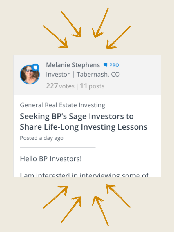
Easily follow discussions with a simpler design. Plus, users stats are more predominantly displayed so you can quickly identify experts.
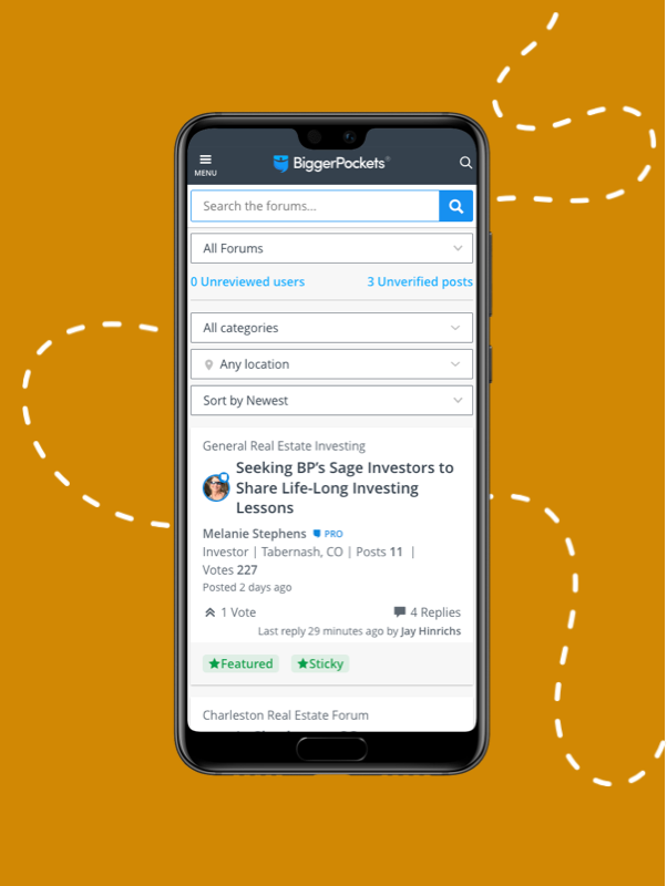
We finally optimized for mobile usability! This way you can stay involved on the go.
Note: the iPhone and Android apps have not been updated, you must visit biggerpockets.com/forums to see the improved mobile experience
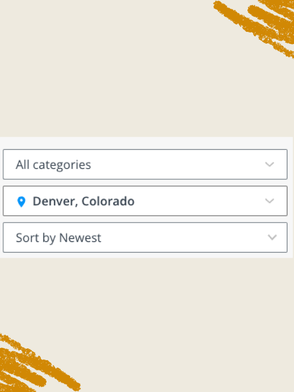
Now tag your topic posts with locations that can be easily found via the location filter at the top of your forums experience. Find what you’re looking for faster.
A clean new design with all the most relevant information prominently displayed. This makes the conversation amongst BiggerPockets members that much easier to read!

@Bjorn Ahlblad the only way I found it was to go to your profile under your picture. It will show you all of your posts. They don't have anyone's else post until you click on the post.
I dont like to be a debbie downer, but this new version eats up all my screen for only a few threads and honestly I cant spend all day scrolling to see if there is anything interesting to read....
I dont really understand why you cant just buy already existing forum software that is easy to read, search, respond, etc. ,
I am having trouble finding older posts. For example, in the STR forum I can’t see threads beyond page 19, 2 months ago. Could “Sort by Newest” be a sort by age toggle?
@Bjorn Ahlblad the only way I found it was to go to your profile under your picture. It will show you all of your posts. They don't have anyone's else post until you click on the post.
Thanks Tim for reinforcing my point! Hopefully we will get this all resolved.
Here's my visual feedback. As @Mike S. stated I think showing all of the poster stats with the poster description, post count and vote count is very distracting and also confusing. When I see the User post count & vote count, I keep thinking that is the # of posts on this Forum post. That information seems unnecessary.
Otherwise, by just making some small visual changes I think the overall forum posts would look a more compact and easier to scroll through. In the screenshot below the overall height of each forum post has been reduced by 50%.
Generally speaking, I also think the font-sizes are too big.
Just my .02 cents.
@David Robertson thanks for the detailed feedback you and others have pointed out about the list view, we have prioritized and are tracking changes...appreciate it
I’m just happy it’s finally easier to see quotes and differentiate the text.
What is the timeline to update the apps?
Also, as always, I must recommend a dark mode, please. My eyes are burning. 😂
@Frank McGovern thanks for the feedback...the app has been something thats been requested a lot and is definitely on our radar. We really want to make sure it is a great user experience so we are getting our ducks in a row as we chart out the timeline for it.
well I just tried it again and it appears it takes 3 clicks to get to the last post.
one to open the forums two to open the thread and three to click on the Oldest newest tab.. and oldest comes up so unless you know there is a newest under neath that tab you maybe stymied a big.. but then you click newest and U get to the last post. but I agree it would be great just to have a seperate tab for Last post its more intuitive and would save one click.
Am I dumb or is that tab not available for me? I do not see an Oldest/Newest tab on this thread. I'm on my desktop currently. That option is only available on mobile?
well I just tried it again and it appears it takes 3 clicks to get to the last post.
one to open the forums two to open the thread and three to click on the Oldest newest tab.. and oldest comes up so unless you know there is a newest under neath that tab you maybe stymied a big.. but then you click newest and U get to the last post. but I agree it would be great just to have a seperate tab for Last post its more intuitive and would save one click.
Am I dumb or is that tab not available for me? I do not see an Oldest/Newest tab on this thread.
It is right after the initial post and right before the first response. Apparently you have to hit it every time to get to the newest posts.
well I just tried it again and it appears it takes 3 clicks to get to the last post.
one to open the forums two to open the thread and three to click on the Oldest newest tab.. and oldest comes up so unless you know there is a newest under neath that tab you maybe stymied a big.. but then you click newest and U get to the last post. but I agree it would be great just to have a seperate tab for Last post its more intuitive and would save one click.
Am I dumb or is that tab not available for me? I do not see an Oldest/Newest tab on this thread.
It is right after the initial post and right before the first response. Apparently you have to hit it every time to get to the newest posts.
Thanks, I was just blind. I see it. Yes, once you post it switches back to "oldest" even on the same thread.
well I just tried it again and it appears it takes 3 clicks to get to the last post.
one to open the forums two to open the thread and three to click on the Oldest newest tab.. and oldest comes up so unless you know there is a newest under neath that tab you maybe stymied a big.. but then you click newest and U get to the last post. but I agree it would be great just to have a seperate tab for Last post its more intuitive and would save one click.
Am I dumb or is that tab not available for me? I do not see an Oldest/Newest tab on this thread. I'm on my desktop currently. That option is only available on mobile?
you have to go to the beginning of the thread right under the first post and above the first response you will see something that says oldest well if you click on that it does a drop down and says newest you click that and the thread reverses with the newest posts at the top and descending down to the oldest.
While fixing the bugs (or even rewriting this "newis better first, can there be a way to "save/favorite" old threads with some sort notes? The same topics keep being asked and its so much easier to reference them to the old threads instead of retyping everything out. Plus, the OP gets the benefit of everything else that was written.
Please bring back the "Switch to Old Forums" button.
@Greg Scott could you share some of the specifics of your feedback to the new format?
thanks
FORUM LIST
The new forums is like reading someone's facebook feed. Scrolling, scrolling, scrolling. There is a lot of irrelevant information and lots of scrolling. Where is the stuff I want to see?
The old forums used to be like reading a table of contents. You can quickly go find what you want. You will see many of the complaints in here are related to that.
Logging in a few minutes ago on a different computer, I was thrilled to see a compact forum title list. I had assumed that you had made some adjustments. I was soon equally disappointed when after a few clicks, the menus expanded back out to what I was seeing last night and only see the facebook-style list of name, location, number of posts, and all the other irrelevant stuff. I was hoping I had tripped a setting so started playing with all the controls.
I noticed the toggle in the upper right, but I see almost no difference between compact mode and expanded mode. Why even have the choice?
That is why I loved the "Switch to Old Forums" button. Compact View. The only time I ever used the new forums was when I wanted to see a post from a Pro member. (For some reason the old forums would not show those.) I always immediately went back to the old forum for the compact view.
FORUM POST
Based on my experience today, I suspect there is something going on with cached information and the new forum when you hit it the first time.
My first experience in the new forum was very disorienting. I was having trouble even typing and many of the controls were not working. It felt like I was in a half-functional web page. Those problems now seem gone.
Please bring back the "Switch to Old Forums" button.
@Greg Scott could you share some of the specifics of your feedback to the new format?
thanks
FORUM LIST
The new forums is like reading someone's facebook feed. Scrolling, scrolling, scrolling. There is a lot of irrelevant information and lots of scrolling. Where is the stuff I want to see?
The old forums used to be like reading a table of contents. You can quickly go find what you want. You will see many of the complaints in here are related to that.
Logging in a few minutes ago on a different computer, I was thrilled to see a compact forum title list. I had assumed that you had made some adjustments. I was soon equally disappointed when after a few clicks, the menus expanded back out to what I was seeing last night and only see the facebook-style list of name, location, number of posts, and all the other irrelevant stuff. I was hoping I had tripped a setting so started playing with all the controls.
I noticed the toggle in the upper right, but I see almost no difference between compact mode and expanded mode. Why even have the choice?
That is why I loved the "Switch to Old Forums" button. Compact View. The only time I ever used the new forums was when I wanted to see a post from a Pro member. (For some reason the old forums would not show those.) I always immediately went back to the old forum for the compact view.
FORUM POST
Based on my experience today, I suspect there is something going on with cached information and the new forum when you hit it the first time.
My first experience in the new forum was very disorienting. I was having trouble even typing and many of the controls were not working. It felt like I was in a half-functional web page. Those problems now seem gone.
@Greg Scott thanks for the feedback, because of all the feedback with the list view vs cards view we are prioritizing and will be assessing.
Going back to the forums I was surprised to again see a compact view. I clicked the toggle in the upper right, and the forum expanded into the long view that I dislike. Clicking the toggle once more, it shrunk down into a very compact view. The compact view works great for me.
It does appear there is a significant caching issue. I apologize for my harsh comments previously.
Going back to the forums I was surprised to again see a compact view. I clicked the toggle in the upper right, and the forum expanded into the long view that I dislike. Clicking the toggle once more, it shrunk down into a very compact view. The compact view works great for me.
It does appear there is a significant caching issue. I apologize for my harsh comments previously.
Where did you see the toggle to change views? I don't have it......
And now it stopped working again and all I see is two versions of an expanded view and the toggle barely makes a difference.
@Greg Scott are you saying that the card view and list view are exactly the same for you?
the card view should give a sentence or two preview of the post whereas the list view shouldn't...we are working on changes to the list view currently but nothing has changed since the release. if you are having issues then it may be a caching issue but we'll also check things out on our end.
Going back to the forums I was surprised to again see a compact view. I clicked the toggle in the upper right, and the forum expanded into the long view that I dislike. Clicking the toggle once more, it shrunk down into a very compact view. The compact view works great for me.
It does appear there is a significant caching issue. I apologize for my harsh comments previously.
Where did you see the toggle to change views? I don't have it......
@Bruce Woodruff it should be at the right of your screen shown here
Just curious - is there any possibility of going back to the old format (or building a similar new version) ? Or are you guys just going to keep tweaking this new version?