Fort Worth, TX · Member since 2020 · 1k+ posts · 2k+ votes
Good news! There are some awesome improvements to the forums that allow for an easier user experience. Keep reading for the highlights.
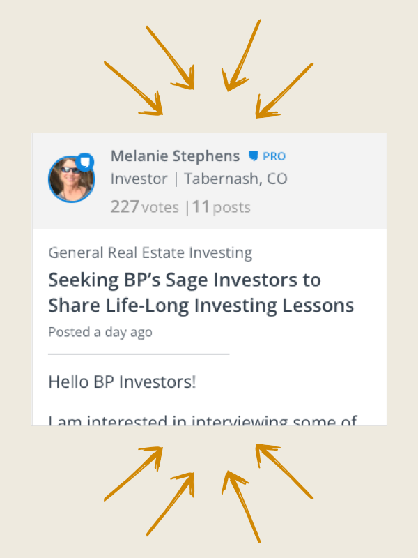
Easily follow discussions with a simpler design. Plus, users stats are more predominantly displayed so you can quickly identify experts.
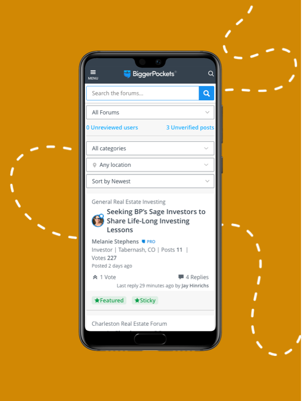
We finally optimized for mobile usability! This way you can stay involved on the go.
Note: the iPhone and Android apps have not been updated, you must visit biggerpockets.com/forums to see the improved mobile experience
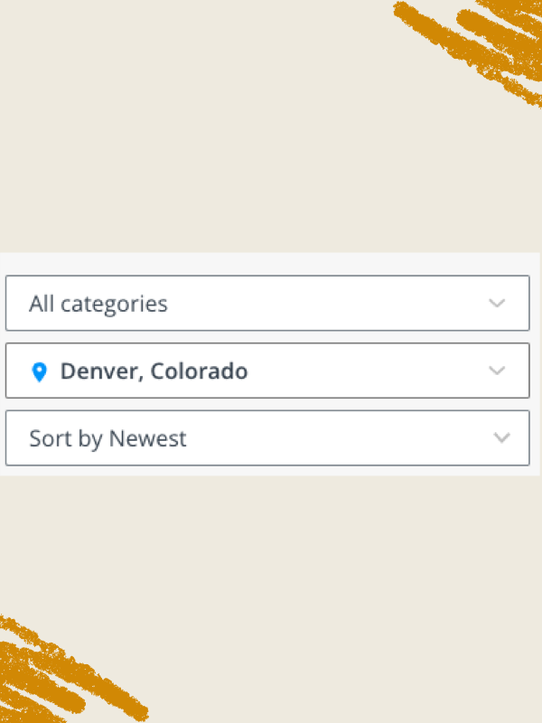
Now tag your topic posts with locations that can be easily found via the location filter at the top of your forums experience. Find what you’re looking for faster.
A clean new design with all the most relevant information prominently displayed. This makes the conversation amongst BiggerPockets members that much easier to read!
You guys have done and are doing both. Not smart.....but this is your business, you do what you gotta do. I'd say next time, don't bother asking for input......
I could not seem to upvote, so I will thank @Bruce Woodruff for his comments. I guess the good news is I'll free up some screen time to build sweat equity.
Two concepts which I would normally charge you $10,000 for each. Nate your in Michigan. This spring overnight 5 pounds of black sweet cherries to me, please.
1. Improvement Process
Have someone take all of these suggestions and put individually on a yellow sticky and put it on a wall. One comment just once. Don’t care how often it was repeated.
Have two other people come in and put these into categories.
Have two other people user interaction people come in and on a scale of 1 to 10 highest rank them from a user standpoint
Have another two system techs come in and rank them in terms of ease of implementing. Easy/ medium/ hard
Now have the leaders come in and do the following. Agree on a staged implementation plan. Don’t sprinkle them in. So releases. Recommend easy first, no matter impact. Some you won’t do. They will be for future phases
Recommend you do Beta on each release
Process thinking- time to move to the big leagues. Don't just think of process in this instance. Take it through the entire organization. I'll know you did it, if at the next BP conference at the luncheons and happy hours you have congregation signs standing around. STR, multi, syndication, financing, etc. I love talking with people but I never did find another person that did self storage. Yes, I'll go to a Self Storage convention
2. BP monetization
Before you do one above draw a map of BP’s monetization
Draw a map from the forum/website to your monetization models and for your Commercial “Experts”.
Understand your users. A. Will never make an investment, just kicking the tires, B. New investors starting the climb, C. Active investors scaling, D. Seasoned Investors giving back, E. Commercial users monetizing their experience and systems, F. Idiots like me killing time watching my storage units fill up or taking a break.
Right now your model is to throw all of these together and count posts and responses and views. I hate it when I have to wade through a post asking who is a good landscaper in Podunk, USA. Make money off that person, create a model. Make my experience better so I like adding value.
Your value and cred comes from the posts. Realize they are free to you but they support the value and access for all other value chains. If you take away the posts none of the above users will value the forum.
Remember 5 pounds of overnight black cherries this spring from Michigan.
And now it stopped working again and all I see is two versions of an expanded view and the toggle barely makes a difference.
@Greg Scott are you saying that the card view and list view are exactly the same for you?
the card view should give a sentence or two preview of the post whereas the list view shouldn't...we are working on changes to the list view currently but nothing has changed since the release. if you are having issues then it may be a caching issue but we'll also check things out on our end.
thanks
Nate:
Even on "compact" view, how the forums appears seems to change. (Could be an adaptive design issue.) I have one machine that looks very different when I log on, but within 5 minutes changes. (see screen shot)
FWIW, this is how I WISH the forums looked, so am disappointed every time it switches back. No surprise based on my previous comments. I like a very compact view, much like the previous forums. I do not like
Scrolling and Scrolling and Scrolling and Scrolling and Scrolling and Scrolling and Scrolling
@Greg Scott not sure why yours keeps switching back and forth but we will look at it. We are prioritizing a simpler compact view based on your and others feedback so please keep a look out.
Good news! There are some awesome improvements to the forums that allow for an easier user experience. Keep reading for the highlights.
how does one send a Colleague request? I cant see where the button for those are or how to send a PM to some one ? where is that at .
Easily follow discussions with a simpler design. Plus, users stats are more predominantly displayed so you can quickly identify experts.
We finally optimized for mobile usability! This way you can stay involved on the go.
Note: the iPhone and Android apps have not been updated, you must visit biggerpockets.com/forums to see the improved mobile experience
Now tag your topic posts with locations that can be easily found via the location filter at the top of your forums experience. Find what you’re looking for faster.
A clean new design with all the most relevant information prominently displayed. This makes the conversation amongst BiggerPockets members that much easier to read!
I'm a long time poster in these forums and agree with @Greg Scott ...if you guys are going to do this, bring back the "Switch to Old Forums" button. I don't like that we don't get a say every time this is changed and it's not user friendly at all compared to how the old look/user experience was. When this happened a few months back or whatever, it just seems they want to 'change to change,' rather than actually have a rhyme/reason to. Thanks
Joe - Thanks for the candid response. I think you're a good guy., Frankly though, I don't care to invest 3 months of time to learn a new platform...particularly when the old one worked perfectly.
I've been self-employed for more than 40 years and there are a few rules I've learned and two in particular that you do not screw with. 1) Do not alienate/frustrate/make things harder on your customers. 2) Do not EVER give your competition an opening. EVER.
You guys have done and are doing both. Not smart.....but this is your business, you do what you gotta do. I'd say next time, don't bother asking for input......
-------
I have to completely agree with the above and wish I could upvote more than just once. You guys tried this a bit ago and it again, deterred users who had been long time posters and active users. As a long time poster and user of Biggerpockets, and someone who regularly gets referral business from this site, the format really makes me reconsider my membership as well as being an active part of this community. And the sad thing about that is there are a lot like me. I love this forum, but there's no need to fix something when it's not broken.
I go to the Forums and I'm supposed to different categories. There aren't any. I'm a realtor and want to subscribe to a category for Farming. Can't find anything close to it.
Here is an old video I found on youtube but apparently things have changed since 2013
Good news! There are some awesome improvements to the forums that allow for an easier user experience. Keep reading for the highlights.
There is a saying "Do not fix what is not broken" this applies here. Please BP mods red the reviews there is a larger number of members saying "Go back" to older view. Please make an option to restore the old forum View because this is way to much of a unnecessary change. No offense but what was the end goal here because even the "Vote" option makes no sense how would you know what your clicking on with two arrows up and just a number next to votes? Please listen to paying members...
Easily follow discussions with a simpler design. Plus, users stats are more predominantly displayed so you can quickly identify experts.
We finally optimized for mobile usability! This way you can stay involved on the go.
Note: the iPhone and Android apps have not been updated, you must visit biggerpockets.com/forums to see the improved mobile experience
Now tag your topic posts with locations that can be easily found via the location filter at the top of your forums experience. Find what you’re looking for faster.
A clean new design with all the most relevant information prominently displayed. This makes the conversation amongst BiggerPockets members that much easier to read!
Forums are a big feature that BP touts. With the old forums, even with a "Pro" membership, it was hard to effectively search through posts. Now with this new release, it is considerably harder. If I do a location search with 'Jacksonville', how is it that there are only 2 pages of posts?
I'd like the ability to search different topics and posts for specific areas I'm researching
Maybe someone else has mentioned it, but it seems like every time I'm on the site, the view is different. Sometimes like this:
Then the next time like this:
Also, surprised that I'm the only one that seems to be pushing for a "go to first unread post" function. For instance, this very thread now has 6 pages. Why can't I "go to first unread post" like I can on other forums I'm a member of? I understand I can sort by newest but then I'm reading posts chronologically backwards. I literally have to toggle and scroll thru 6 pages of posts to find where I left off. Am I missing something??
I agree. I think that was part of my very first post on this thread ---- scroll WAY BACK. There are so many fundamental problems with this UI its tough to know where to start. lol
Also, while you're fixing the new forum so it's like the old forum :-)...... can we have back the ability to enlarge a members picture when it is clicked on? It helps to know who you're giving advice to....(mainly age-wise). Not sure why that was changed but then I don't know why anything was changed.
Where can we find the local events? It made so much sense to have them under the Network tab. Can there be a "Find a Local BP Meetup" tab? When I search for my town's meetup, it shows many years/months of previous posts, but not the current one coming up. Please let me know where to find this more efficiently so I can tell the rest of my group. Thanks!
More input, since you seem determined to stick with the new format. It may have been mentioned, but every time I go to a thread, it starts at the top and doesn't instantly go down to the 'last read'....
I go to the Forums and I'm supposed to different categories. There aren't any. I'm a realtor and want to subscribe to a category for Farming. Can't find anything close to it.
Here is an old video I found on youtube but apparently things have changed since 2013
Help me.
The categories are listed at the top of the forum feed now. You can still subscribe, but I don't know of any subforum specific to farming. We are actively working on increasing the category ease of use to make this function correctly.
Where can we find the local events? It made so much sense to have them under the Network tab. Can there be a "Find a Local BP Meetup" tab? When I search for my town's meetup, it shows many years/months of previous posts, but not the current one coming up. Please let me know where to find this more efficiently so I can tell the rest of my group. Thanks!
This is something that we are actively working on. @Nate Slappey III
I started to search through this thread to see if it was already posted, but the thread is long so I thought i would post my question realizing that the answer could already be in this thread,
When I post in a thread, the following is automatically turned on. On the old forum, the following had to be actively selected. I suspect there are some users that want the following to be on when they reply and users like me that would prefer to have to actively select the following.
Is there a way for me to turn my default to "not following"? If there is not, I would prefer the site default to be not following.