- Real Estate Agent
- Columbus & Cleveland, OH
- 1,753
- Votes |
- 1,506
- Posts
Did anyone actually ask for this new BP layout?
The new BiggerPockets layout is a downgrade imo.
I get they were trying to modernize the site, but I think they missed the mark. There's way too much empty space, everything feels spread out, and it's harder to scan through posts and find what you're looking for. The old layout let you quickly browse discussions and absorb a lot of information at a glance. This new one just feels less intuitive and takes more effort to use.
I really don't get why they changed something that wasn't broken. The old layout wasn't the prettiest, but it was clean, efficient, and easy to navigate. This redesign feels like it prioritized looking modern over making the experience better.
Curious if I'm the only one who feels this way or if other people prefer the old layout too.
- Samuel Diouf
- [email protected]
- (614) 662-1652

Most Popular Reply

Thank you for the conversation on this. I really appreciate the passion that you all have for BP. @Samuel Diouf I'd be curious to know how you were scanning and what kind of information you were looking for, we can always incorporate that feedback into further design changes. If you don't mind describing it further that will be helpful.
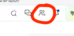
In the meantime, have you seen the new activity feed (aka network tab)? It show all the activity from folks you are connected with / follow. You can access it from your navigation menu (although it might still be in beta and only available to handful of folks, so if its not there, let me know and I can activate it for you). Screenshot included so you can find it.
Best,
Laurence