Did anyone actually ask for this new BP layout?

Did anyone actually ask for this new BP layout?

Samuel DioufBusiness Member
Real Estate Agent · Columbus & Cleveland, OH · Member since 2023 · 1k+ posts · 1k+ votes

The new BiggerPockets layout is a downgrade imo.

I get they were trying to modernize the site, but I think they missed the mark. There's way too much empty space, everything feels spread out, and it's harder to scan through posts and find what you're looking for. The old layout let you quickly browse discussions and absorb a lot of information at a glance. This new one just feels less intuitive and takes more effort to use.

I really don't get why they changed something that wasn't broken. The old layout wasn't the prettiest, but it was clean, efficient, and easy to navigate. This redesign feels like it prioritized looking modern over making the experience better.

Curious if I'm the only one who feels this way or if other people prefer the old layout too.

12Reply
604 views

Most Popular Reply

Laurence J.Pro Member
Rental Property Investor · Chicago IL · Member since 2013 · 22 posts · 39 votes
3w

Thank you for the conversation on this. I really appreciate the passion that you all have for BP. @Samuel Diouf I'd be curious to know how you were scanning and what kind of information you were looking for, we can always incorporate that feedback into further design changes. If you don't mind describing it further that will be helpful.

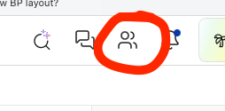
In the meantime, have you seen the new activity feed (aka network tab)? It show all the activity from folks you are connected with / follow. You can access it from your navigation menu (although it might still be in beta and only available to handful of folks, so if its not there, let me know and I can activate it for you). Screenshot included so you can find it.

Best,

Laurence
BiggerPockets
See this reply in the discussion

16 Replies

Jump to latestLatest
  • New to Real Estate · Denver, CO · Member since 2019 · 40 posts · 25 votes
    3w

    I agree.

  • Chris SeveneyBusiness Member
    Moderator
    Investor · VA · Member since 2015 · 21k+ posts · 19k+ votes
    3w

    they are still working on adding some improvements and other features to the site. personally i typically use this on my phone and not on the web but i do prefer this layout over the old. what i really like is that on the home screen you can see investors who are nearby and next to you. 

    7e investments53 Reviews
    • Jay HinrichsBusiness Member
      Real Estate Consultant · Summerlin, NV · Member since 2014 · 45k+ posts · 66k+ votes
      3w

      I found that map your talking about.. one of the members I know who is a big PM he has his intials on many many properties so much assume those are the ones he manages for others.. but agree thats a handy bit of information.. especially for those of us that might have an asset in a market and are looking for members to do drive bys or see if they need our services etc.

  • Theresa HarrisPro Member
    Member since 2019 · 15k+ posts · 11k+ votes
    3w

    Still figuring out where some of the things are that I use. Changing it may show me some new features I didn't know about, as long as I can find the ones that I use, I'm fine with it.

  • Jay HinrichsBusiness Member
    Real Estate Consultant · Summerlin, NV · Member since 2014 · 45k+ posts · 66k+ votes
    3w

    everytime they change something you have those that like it and those that dont.. for me this loads way faster than the older ones.

    one thing that i dont see is on the original post is it 5 years old or 5 minutes

  • Investor · Fort Washington, MD · Member since 2014 · 1k+ posts · 1k+ votes
    3w

    Yea, I don't get it either. I know BP lost popularity but it wasn't because of the way the site looked. Doesn't work for me. I noticed multiple things but taking away the number of likes in a weird way, limits some ability to know if the person commenting knows what they are talking about. LOL

    • Jay HinrichsBusiness Member
      Real Estate Consultant · Summerlin, NV · Member since 2014 · 45k+ posts · 66k+ votes
      3w

      I did not notice the likes.. agree 100% on that one.. it is one of the best barometers for folks to judge the veracity of the person posting.

      for example the person with 1000 post and 25 likes is probably just posting the same thing over and over cut and paster.

      the person with 1000 posts and 2000 likes is generally posting actionable content that other members like.

    • Investor · Fort Washington, MD · Member since 2014 · 1k+ posts · 1k+ votes
      3w

      If I was a newbie, and I saw someone with 1000 posts and 2399 likes, for me, it would say most of the forum views them as credible and knowledgeable. If they had 1000 and 25 likes, I'd assume they were a bozo or troll who didn't know what they were talking about. LOL

    • Technology · Dallas, TX · Member since 2022 · 449 posts · 288 votes
      3w

      Aye good point. We'll put it back.

      BiggerPockets
  • Laurence J.Pro Member
    Rental Property Investor · Chicago IL · Member since 2013 · 22 posts · 39 votes
    3w

    Thank you for the conversation on this. I really appreciate the passion that you all have for BP. @Samuel Diouf I'd be curious to know how you were scanning and what kind of information you were looking for, we can always incorporate that feedback into further design changes. If you don't mind describing it further that will be helpful.

    In the meantime, have you seen the new activity feed (aka network tab)? It show all the activity from folks you are connected with / follow. You can access it from your navigation menu (although it might still be in beta and only available to handful of folks, so if its not there, let me know and I can activate it for you). Screenshot included so you can find it.

    Best,

    Laurence

    BiggerPockets
    • Samuel DioufBusiness Member
      OP
      Real Estate Agent · Columbus & Cleveland, OH · Member since 2023 · 1k+ posts · 1k+ votes
      3w

      For me, the biggest issue is that the forums just aren't as easy to scan anymore. The old layout made it really easy to jump through posts and quickly find what I was looking for.

      The threads are also harder to follow. It's not as obvious who posted what, the profile info doesn't stand out as much, the timeline is harder to follow, and like what @Jay Hinrichs mentioned I also noticed you can't see a user's total vote count anymore, which I thought was a valuable feature.

      I just think the overall visuals took a step backward. Everything kind of blends together now. Maybe adding clearer outlines, more color differences, or separation between each post would help make discussions easier to read instead of everything feeling merged together.

      The old layout wasn't flashy, but it was clean, easy to follow, and let you take in a lot more information at a glance.

      I'll definitely check out the activity feed though. Appreciate you pointing that out.

      I also only use BP on PC since the old mobile version was pretty buggy, so if that's improved, that's a huge plus with this update.

  • Remington LymanBusiness Member
    Real Estate Agent · Columbus, OH · Member since 2017 · 6k+ posts · 7k+ votes
    3w

    I like it better

  • Attorney · 10451 Mill Run Cir #755 Owings Mills, MD 21117 · Member since 2024 · 302 posts · 113 votes
    3w

    @Samuel Diouf, one thing that would make the new layout more useful for me is a clearer way to see what has changed since the last time I looked at a thread.

    I use BiggerPockets more like a working tool than just something I scroll through. Being able to quickly see which conversations have new replies, where I left off, and whether something new was added would save a lot of time.

    For me, that kind of clarity matters more than whether the site looks newer. The easier it is to pick up a conversation where you left it, the more useful the forums become.

  • Lender · Tampa, FL · Member since 2013 · 2k+ posts · 2k+ votes
    3w

    Not a fan either. Honestly, I've been so turned off by all the bots, AI, fake posts, etc that have been becoming increasingly prominent that I really haven't been logging on and participating. I would much prefer a focus on eliminating that (yes, I already report them when I see them), but sifting through the noise has become frustrating and add that new change and I've logged on less and less. 

  • Real Estate Investor · Memphis, TN · Member since 2016 · 402 posts · 129 votes
    3w

    I like the Messaging feature. The mobile version is not as responsive as the desktop versus. The new layout feels clean.

  • Adam BartomeoBusiness Member
    Real Estate Broker · Cape Coral, FL · Member since 2015 · 2k+ posts · 1k+ votes
    2w

    Not liking the functionality of the new version.

Join the conversationCreate a free account to reply, vote on answers and follow this thread.