
5 Things That Every Real Estate Investor (Firm) Website Must Have
Technology is moving at a very rapid pace. At times, it is almost troubling to comprehend what the next best thing will be and whether we should follow the band wagon or simply take a path of our own. Web browsing is revolutionizing from desktop to mobile with a mix of companies delivering information through native applications. Through it all, as real estate investors, we must know how and when to technologically evolve. So if your website looks like a page published back when dial-up was a thing, then it is time to reconsider your budget and allocate some funds to revamp your website!
Here are 5 things that every real estate investor’s (investment firm) website must absolutely have:
Clear of Clutter Navigation
- Website navigation is one of the most vital elements in a website. It allows the user or visitor to move throughout webpages and learn more information about your product or service. If your navigation is not clear of clutter, you may confuse the visitor, which will cause them to lose interest, close the webpage, and ultimately it will prompt a failure to seize an opportunity. Your navigation bar must present a way to connect visitors to your contact page, engage visitors to learn about your product and services, and certainly a way for visitors to see your work and accomplishments.
High Resolution Photos and Videos
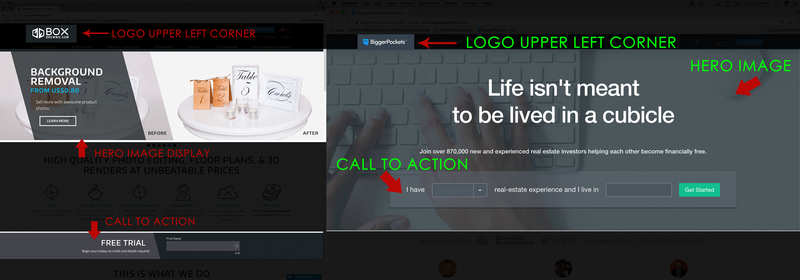
- It is extremely paramount that your website has high resolution photos and videos. Because content is required, bare in mind that your website should capture your visitors attention within seconds. And considering that we are visual beings, it is suggested that a high resolution photo or video is an effective way of captivating our awareness. Another thing to consider is the placement of imagery on the webpage. What we will see in a lot of standard websites today is a logo, located at the top left corner of the navigation bar, a hero image or video display with a CTA to follow. See an example below:

Testimonials
- One thing that is often ignored when designing your website is the importance of adding a section for testimonials. It is studied that as consumers, a high percentage of our purchasing decisions are made based on our knowledge of the product or service from a trusted brand; versus, over a brand that carries no reputation. When adding an area for reviews, be sure that the reviews are authentic and genuinely delivered from recent clients or customers. We all have access to learning more about ones company or brand through search engine that will allow curious consumers the opportunity to debunk any testimonials, which in turn can tarnish your brand if exposed as falsifying testimonials.


Comments (2)
Great posting! I think it's important to realize what your website is hoping to achieve/target too. For example, the younger generations rely more on social media than websites. While I still maintain our company website, our social media platforms are more up-to-date. In fact, we get contacted more through our social media sites than our website. So basically the website is a landing page in a sense.
Ashley Wilson, almost 8 years ago
Ashley, I wholeheartedly agree!
With reliance on social media platforms on the rise, it is imperative that we keep our social media channels relevant. The website should have a landing page effect, of course contingent on what you would like your site to achieve (target marketing), knowing your audience, etc..
Antonio Srado, almost 8 years ago