
Market Cycle Charts with a little more detail
Brandon wrote an introductory piece on market cycles that was good but could have benefited from a chart that wasn't hand drawn for a visual. I had recently sent him a report with some nicer charts (you can see them here) but for a quick look at different ways of visualizing the market cycle check these out:
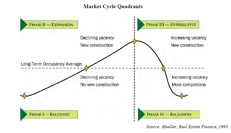
This one is from IRR, Integra Realty Resources:
or this one from Matthew Gardner that illustrates the lag between demand and supply:
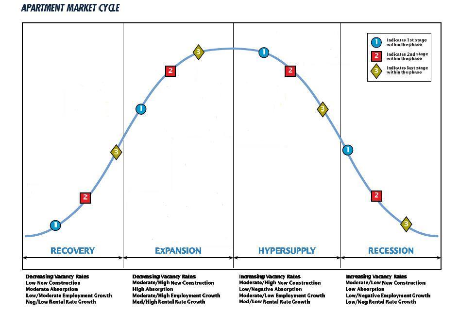
Brandon's sketch showed a horizontal line but he didn't explain what that was; for income properties it represents the long term occupancy average:
What the chart is tracking is occupancy; for more on that see the report I linked to above.
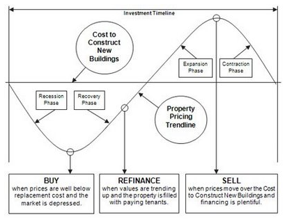
If you are looking at spec building homes or developing commercial real estate then you want to track sales prices vs. the cost to build or what in CRE is called 'replacement cost' which is sometimes broken out as replacement rents:
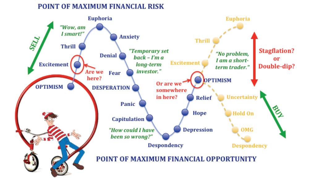
My personal favorite because of the truth in the humor is one Tom Barrack at Colony sent me:
If you want any more detail on market cycles let me know.
Good hunting-
Comments (4)
if I had to wager, I would say we are in the ninth inning or extra inning. Ironic, because now, as in 2006/2007, the Fed started rachetting up interest rates.
Andrew Jurinka, almost 8 years ago
Great explanations with these charts. So... where are we today? Hypersupply? Euphoria?
Andrew Jurinka, almost 8 years ago
Thank you so much for this !
Dan B., over 9 years ago
Insightful. Thanks!
Neal Patel, about 10 years ago